LOGO DESIGN
My approach to branding blends research, storytelling, and design—developing logos that not only stand out but also resonate with audiences. By exploring shapes, textures, and symbols, I create identities that feel human and memorable, transforming simple marks into stories people want to be part of.
Company/Agency: Paradigm Year: 2021-2024
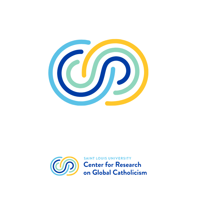
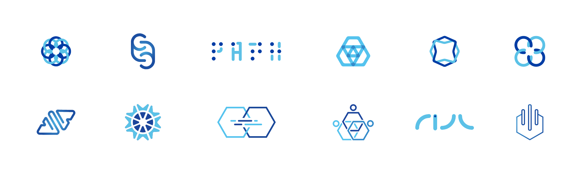
SLU Research Institute
For the Saint Louis University Research Institute, I created logo systems for several emerging faculty-led research groups, ensuring each mark aligned with SLU’s parent brand while expressing the group’s distinct vision. The process began with a collaborative concepting phase, where multiple designers explored diverse visual directions inspired by themes of discovery, innovation, and global impact. From there, the designers refined the strongest ideas into polished logos that balance academic credibility with forward-looking energy.
My designs were ultimately chosen by the client, resulting in a set of marks that convey maturity and confidence—qualities that help position these new research groups for global recognition.
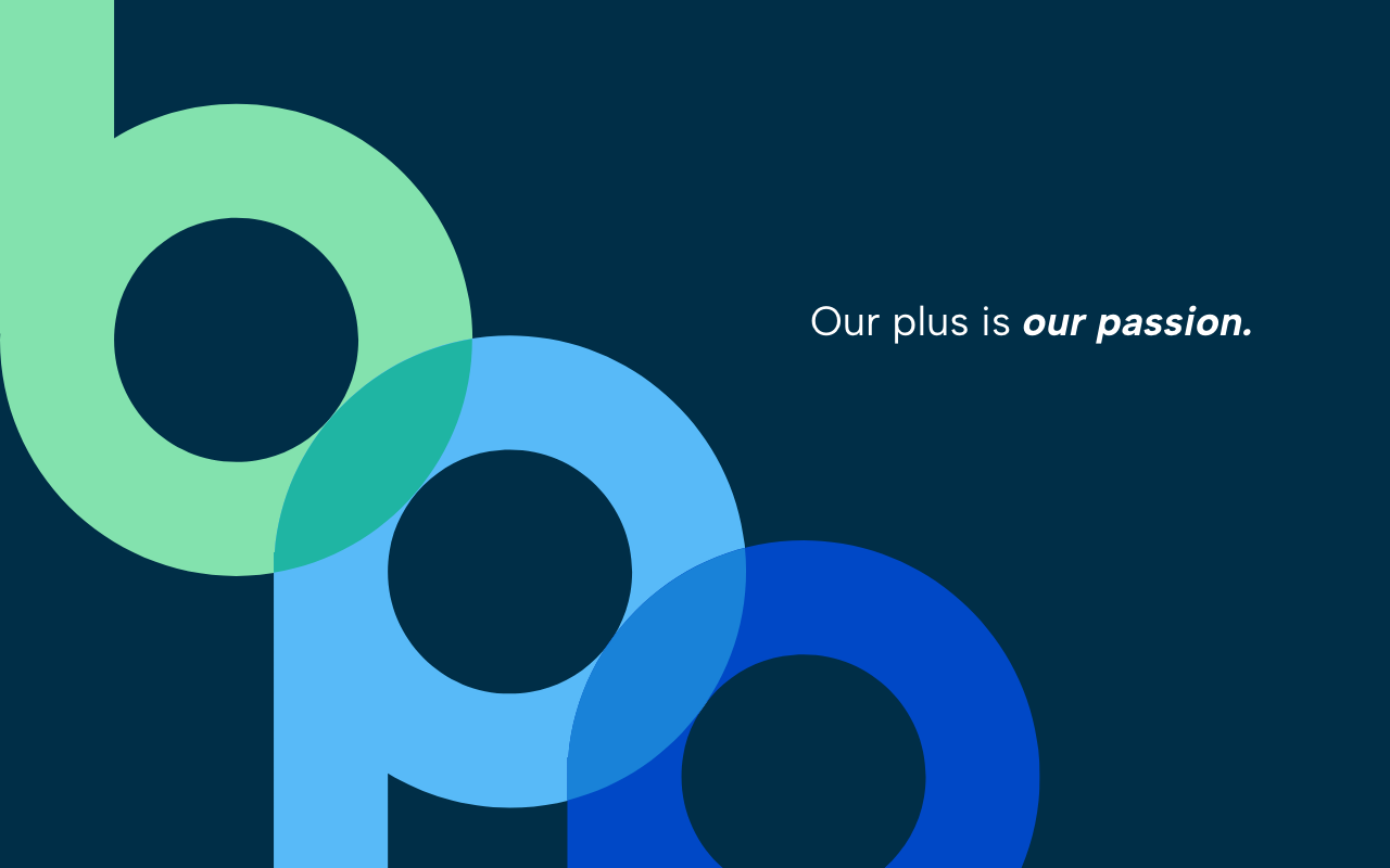
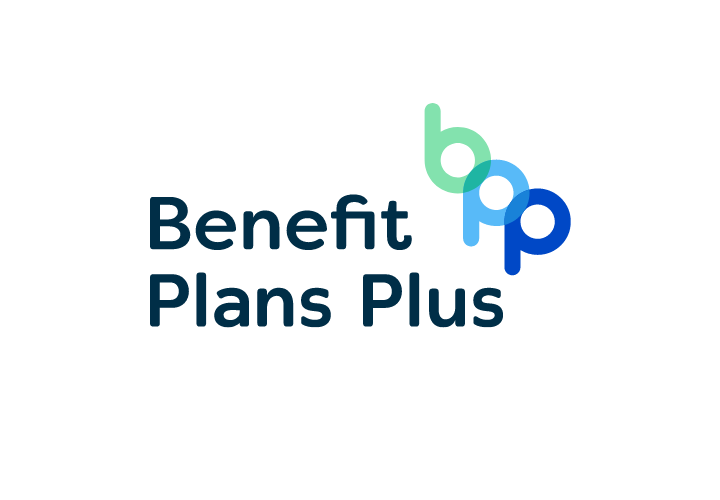
Benefit Plans Plus
For Benefit Plans Plus, I developed a refined visual identity that conveys growth and guidance, centered around a logo built from the overlapping “bpp” letterforms. The fresh green and blue palette reinforces trust and dependability while providing flexibility across both digital and print applications. Supporting graphics—layered patterns and simple geometric elements drawn from the logo mark—add depth and consistency to the brand system.
Together, the logo and visual language establish a confident, purposeful presence that reflects Benefit Plans Plus’ passion for people, planning, and protection.


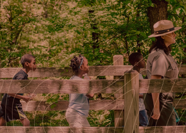
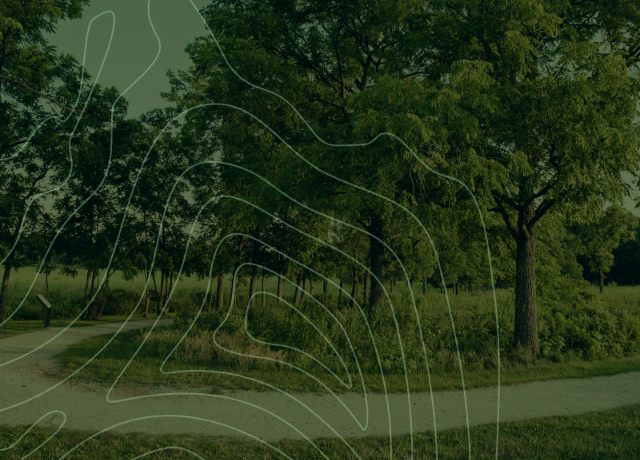
NPS Wellness Challenge
For the NPS Wellness Challenge, I created a dynamic visual identity that unites the human experience with the natural environment. The primary logo combines landscape imagery within a human silhouette, symbolizing how personal wellness and nature are interconnected. Bold colors represent the three core challenge areas: physical, mental, and learning wellness.


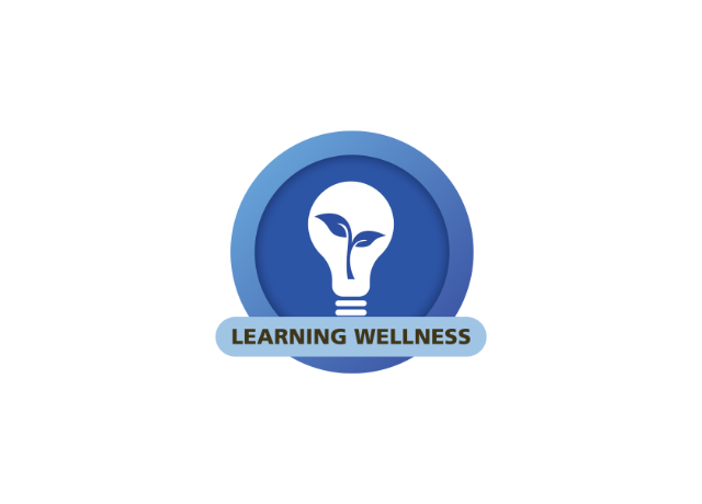
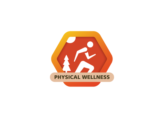
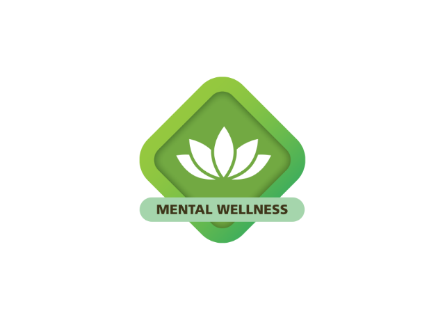
From the master logo, I extended the system into a set of specialized badge logos, each designed to inspire engagement and participation. The energetic orange badge encourages movement and progress for physical challenges, the calming green evokes balance and mindfulness for mental wellness, and the deep blue conveys curiosity and discovery for learning.
Together, this flexible branding system creates a cohesive, inspiring identity that supports the program’s mission of promoting holistic well-being through the national parks.
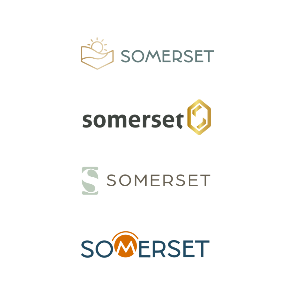
Somerset
Somerset is a modern desert sanctuary, and I explored logos that capture light, rhythm, and calm energy. From sun-inspired motifs to geometric abstractions, each concept evokes a serene yet vibrant community where everyday life feels elevated. Though another direction was chosen, these explorations reflect Somerset’s essence as a space of beauty, connection, and meaningful moments.
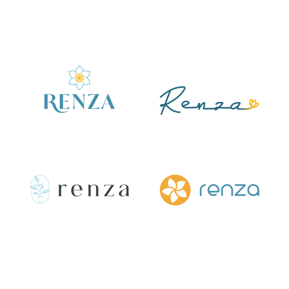
Renza
Renza embodies modern luxury, and my logo concepts balance sophistication with warmth. Sleek geometric forms and contemporary florals were designed to feel curated, editorial, and full of character—reflecting a lifestyle rooted in culture and elevated living. While the client went with another designer, my concepts capture the brand’s spirit of artistry and refinement.