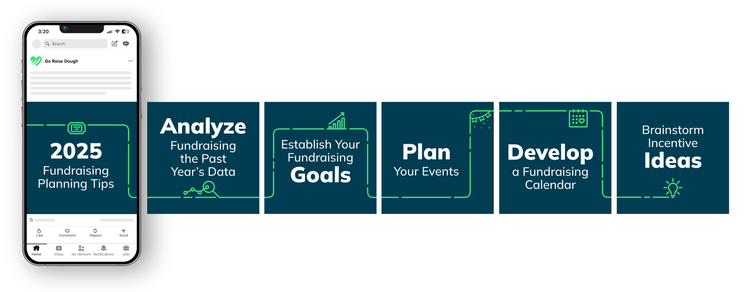
Branding/Social Media
GO RAISE DOUGH
As Go Raise Dough looked to grow into new markets, they wanted a brand that felt as smart and easy to use as their fundraising software. Paradigm kicked things off with conversations to really understand their goals and the heart behind what they do—making online fundraising simpler for nonprofits. From there, I created a fresh visual identity that helped them tell their story, showcase client success, and stand out as a go-to platform for fundraising with impact.
Company/Agency: Paradigm Year: 2024
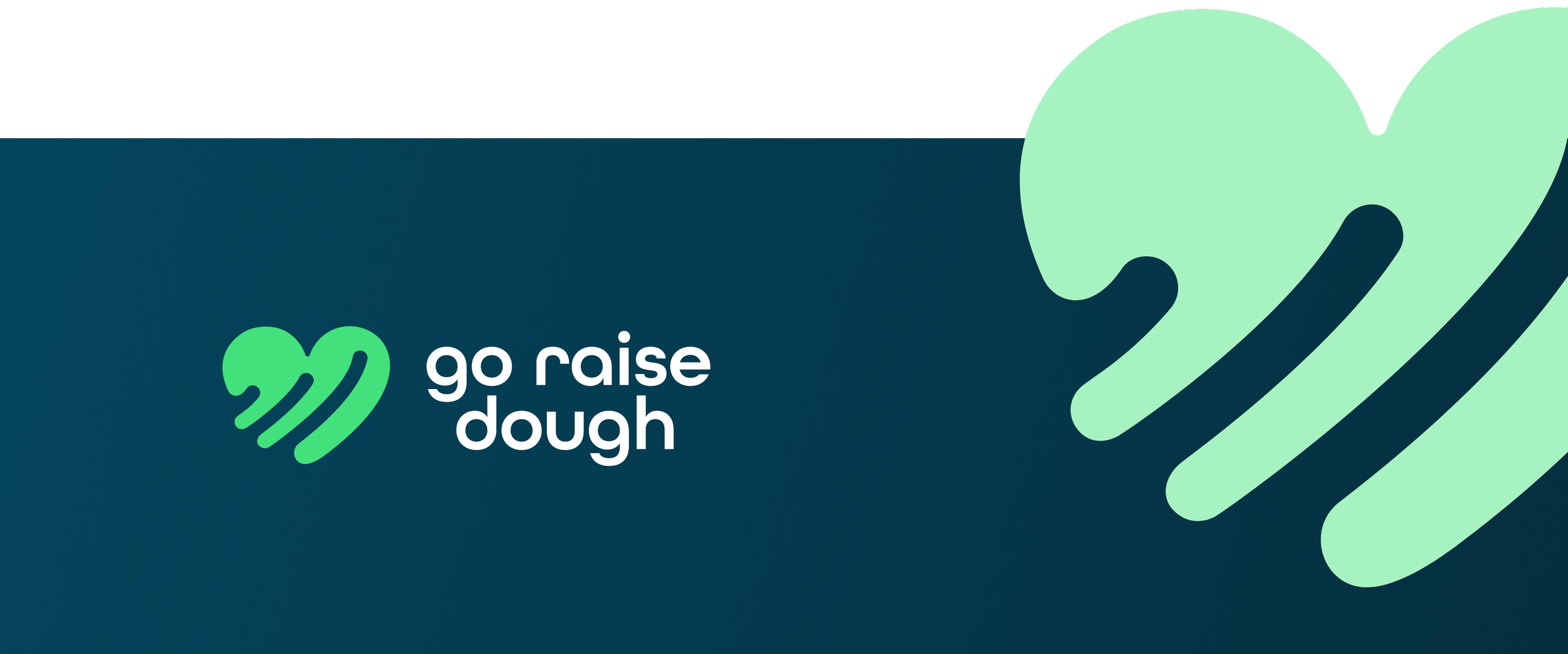
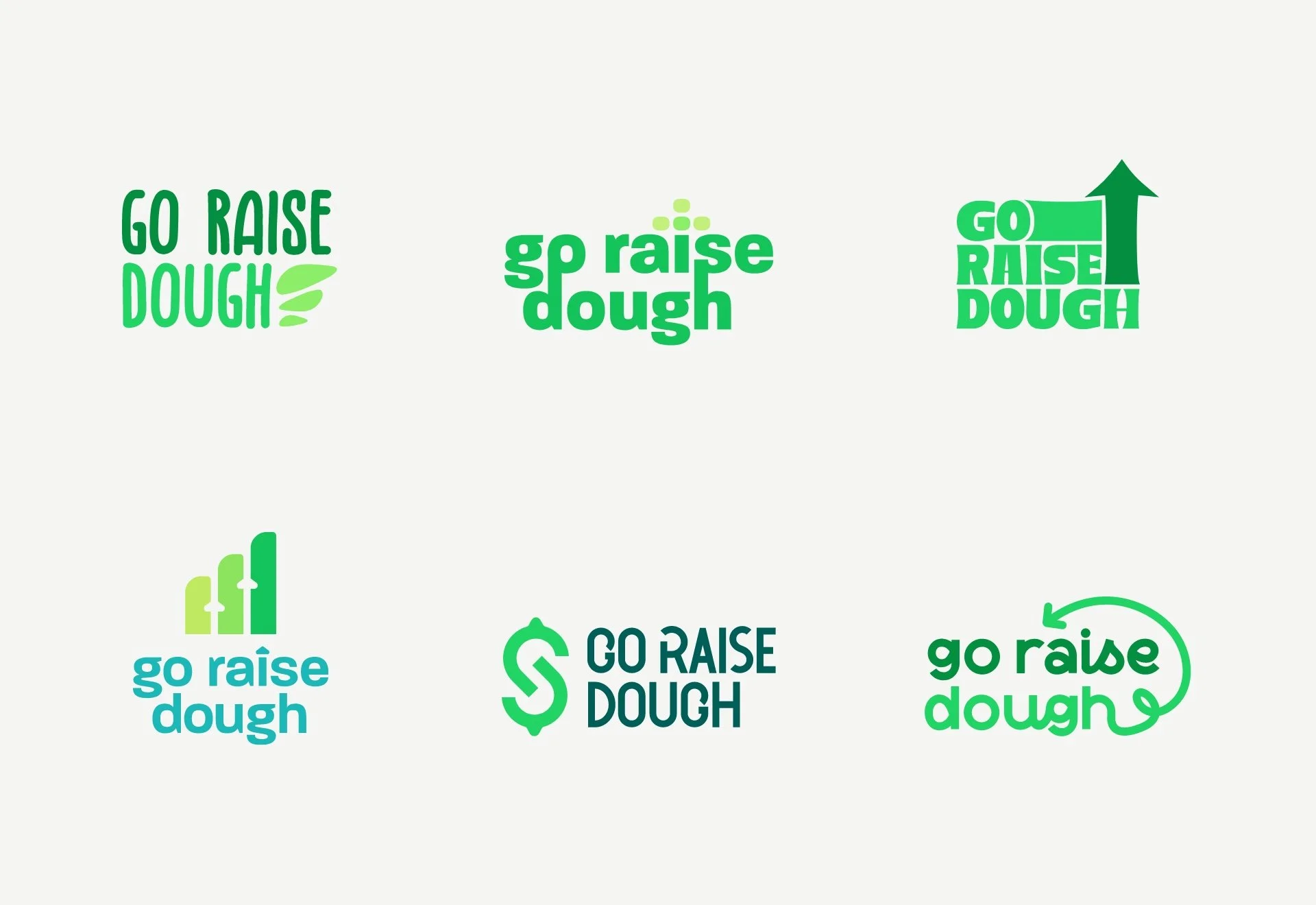
Logo Development
The logo came to life as a bright green heart with three rising lines, symbolizing growth and forward momentum. It was inspired by the idea of a bar graph on the rise—just like the communities Go Raise Dough brings together for a shared cause. The heart shape ties back to connection and purpose, while the bold green not only feels fresh and energetic but also gives a subtle nod to the dollar, reinforcing the fundraising mission in a simple, inviting way.

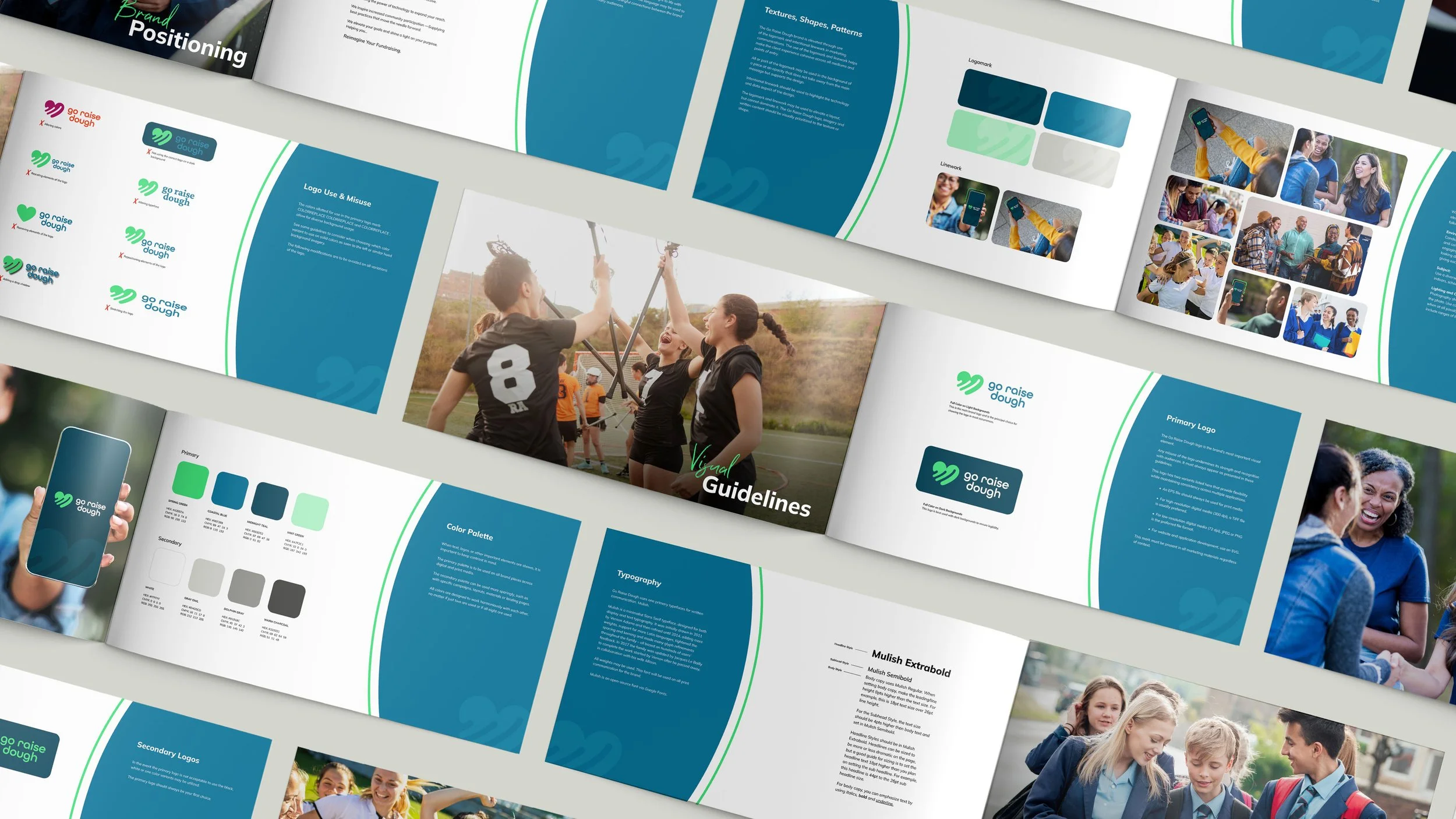
Color Palette & Visual Guidelines
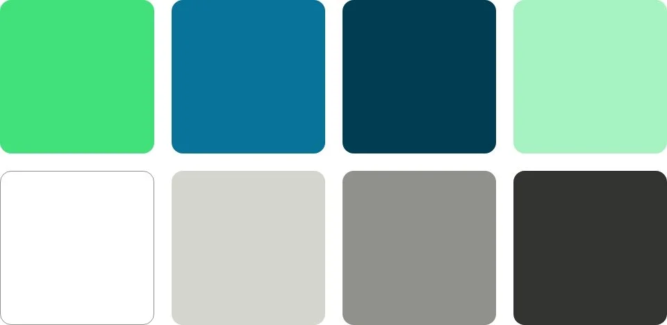
To bring Go Raise Dough’s mission to life visually, I built a color palette rooted in vibrancy, growth, and trust. The bold green leads the pack, symbolizing momentum and energy. I paired it with blues and warm neutrals to strike a balance between friendly and professional.
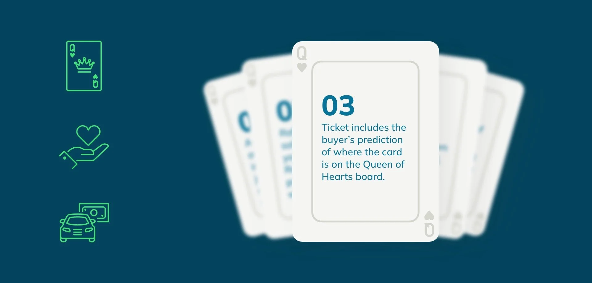
The brand guidelines booklet pulls it all together. From logo usage and typography, every spread is designed to feel approachable yet consistent. The mix of bold color blocks, curved accents, and real imagery gives the brand a people-first vibe.